Part 2 of 3: The POUR method for a Clean Digital Presence

Complexity is the ultimate barrier to growth.
Founders and digital creators often move at the speed of light to launch new ideas. We prioritize speed to get products and services into the world as fast as possible. However, this hurried pace frequently creates a “digital mess”—a website that looks beautiful but remains functionally broken for a significant portion of the audience. To fix this, you must master the POUR method for a clean digital presence.
Furthermore, applying these principles ensures your brand reaches every user, regardless of how they access the web. Consequently, you transition from a cluttered site to a high-performing digital bridge. Let’s deep dive into how these four pillars can transform your strategy.
To keep our digital stewardship on track, we use the POUR method. These four pillars are the foundation of the Web Content Accessibility Guidelines (WCAG) 2.2. They aren’t just for developers; they are for anyone who wants to build a borderless bridge between their brand and their community.
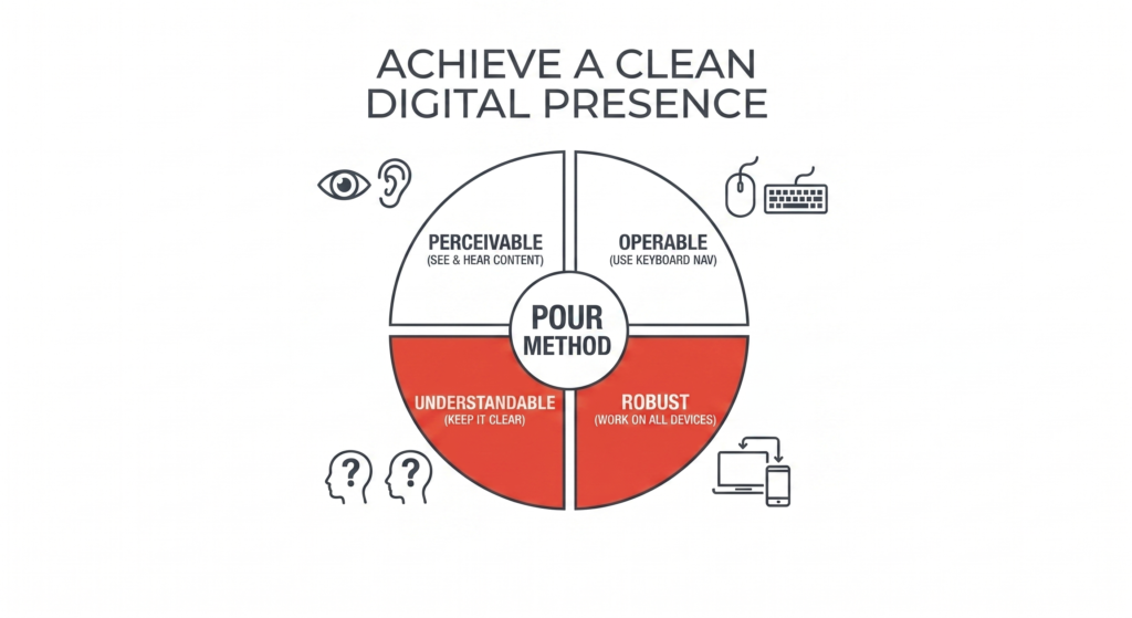
1. Perceivable: Can everyone “see” your message?
Information and user interface components must be presentable to users in ways they can perceive. This means your content shouldn’t rely on only one sense, like sight. If your message is buried in an image with no text description, anyone using a screen reader is effectively blocked from your brand.
- The Fix: Use descriptive “Alt-text” for every meaningful image. Provide captions for your videos and transcripts for your audio content.
- The Stewardship Angle: When you make your site perceivable, you aren’t just helping people with visual impairments. You are helping the person browsing in a high-glare environment or the student watching your video on a noisy bus without headphones.
2. Operable: Can everyone “drive” your site?
User interface components and navigation must be operable. Not everyone interacts with a screen using a standard mouse or a touchscreen. Many people navigate the web using only a keyboard, voice commands, or specialized switches. If your website requires “hovering” to reveal a menu, you’ve created a digital dead end for these users.
- The Fix: Test your site by putting your mouse aside. Can you reach every link, button, and form field using only the “Tab” key? Is there a “Skip to Content” link for power users?
- The Stewardship Angle: An operable site is a high-performance site. By removing friction from navigation, you make your digital space faster and more efficient for every single visitor.
3. Understandable: Is your meaning clear?
Information and the operation of the user interface must be understandable. We’ve all landed on a website where the navigation felt like a riddle. Using “clever” labels or unpredictable layouts doesn’t just confuse people with cognitive disabilities—it creates mental fatigue for everyone.
- The Fix: Use simple, direct language. If a button leads to your contact page, label it “Contact Us,” not “Start the Journey.” Ensure your navigation stays consistent from page to page.
- The Stewardship Angle: Clarity builds confidence. When a user understands exactly where they are and what will happen when they click a button, they feel safe. A confused visitor never becomes a loyal community member.
4. Robust: Does it work everywhere?
Content must be robust enough that it can be interpreted reliably by a wide variety of “user agents,” including assistive technologies. Technology moves fast, and your site needs to keep up without requiring your users to buy the latest, most expensive hardware.
- The Fix: Stick to clean, standard HTML code. Avoid over-complicated “tricks” or non-standard widgets that break on older browsers or mobile devices.
- The Stewardship Angle: A robust site is a durable site. By building with simplicity in mind, you ensure your digital presence stays functional for years, reaching people in different regions and on different devices without fail.
Why POUR Method Matters for Your Brand
By focusing on these four pillars, you aren’t just “checking boxes” to meet a technical standard. You are cleaning up the digital noise and respecting your user’s time, ability, and hardware.
When you remove the barriers, you increase the flow. A site that is Perceivable, Operable, Understandable, and Robust is more than just accessible—it is a professional, polished environment where everyone truly belongs.